Movie: Crazy Rich Asians
Poster
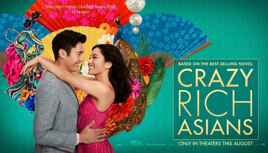
 The poster for this comedy, suggests it's a romantic comedy, due to its use of visual codes. The background is colourful and deliberately laid out that way to highlight its light and comedic tone. It contains peacocks, red and blue fans, along with green leaves and vibrant clothing like scarves, glasses etc. This highlights a stylish lifestyle, and because it's placed behind the main image it implies they're related to it someway or another. The main image is the couple, indicating they're the protagonists in the movie, and given their positive facial expression and gesture (i.e. they're hugging) they're in a happy positive relationship. They're dressed formally, in a suit and a dress, indicating their costumes are proper for a party or another formal event. The font continues the lighthearted but sophisticated tone with the typography in the title "Crazy Rich Asians", a gold block capital font in which the "rich" stands out as the biggest. This typography suggests the main plot of the movie has to do with wealth.
Trailer
The trailer establishes the lighthearted romantic mood throughout the two and a half minutes. For example music is used to emphasise comedy parts such as when someone spills a drink in Nicholas' shirt and there's a silent pause which juxtaposes with the quiet background music in the rest of the trailer. Another example is when there's no music and only dialogue, once Rachel starts to question whether Nick's family is rich or not and he claims they're "comfortable" to what Rachel responds "that is exactly what a rich person would say".
It begins with an almost comic-like separation btween the initial scenes in the trailer, from the skyline, thus the establishing shots set the movie in a city. In this way, when Nicholas mentions his family, there's three lines to separate his mum, dad and sister. It sets up a quick pace so that the viewer gets a fast clear idea of the plot (Nicholas proposing to Rachel and taking her to meet her family in Singapore).
Typography is also used towards the end of the trailer, along with shifts of music volume to emphasise the audience's attention towards the words. The background is green, just like the poster, which makes it stand out along with the yellow words, contrasting in order to drive attention to the message.
At the end, the title for the movie is shown, with the last word changing from "food" to "parties", "family", "style", "mother" to "Asians". All those words tie in with the narrative, so anchorage has been used.
The audience will expect a lighthearted romantic comedy, as both the trailer and the poster highlight these through visual codes and the trailer with moving image and audio codes as well.
No hay comentarios:
Publicar un comentario