lunes, 26 de noviembre de 2018

Advertising Project

Product: Kanken Backpack
Demographic/ target audience: Young adults
Campaigns with similar ideas: #cooltest by Icebreaker co. 
USP: Stylish, Essential, Eco-friendly 
Meaningful message: Long-lasting backpacks that are a must, stylish while being eco-friendly

Newspapers' Analysis

Analyse the following cover in terms of how the technical codes ( main image, headline, pull quote etc.) persuade the audience to buy the newspaper and how the audience is being persuaded to respond to the main news story.

The most visual-striking element in the Mirror's newspaper cover is the main image of the Statue of Liberty's "face-palm". It links to the headline "What have they done?", a rhetorical question that responds in negativity to Trump being elected to be the new US president. The sub-heading "How Trump triumphed... and what it means for you and the world", suggests it will include reasons as to why it is a negative outcome, making people want to buy it as they're curious as to "what it means (for them) and the world". Also, the plug "see pages 2-13" makes it easy for the newspaper-buyers to read the story. Furthermore, the negativity around the news story is mainly created by the bleak choice of colour, black and white, which connotes seriousness and creates a negative effect on the audience. 
Additionally, there's another news story, that is given less importance, due to the US election outcome being known that day, however, the choice of font and colour maintains the bleak negative element. The headline starts with "7 killed in speeding tram crash", which is straightforward in order to cause shock to the reader so that he buys the newspaper to learn about what happened. Once again, the plug that indicates the reader the story can be found on "pages 14&15", making it easy for the audience to find the story they could be interested in. Also, a smaller image is added to include a visual element of the tragedy, which helps create an emotional response.

Analyse which factors that make up the news agenda  ( threshold, unexpectedness, elite nations etc.) are being considered in the choice of cover story.

The Daily Mirror is left-leaning, and therefore its stand against a right-wing leader is somewhat evident. The threshold of the story means such an event is given more importance than a national tragedy, as it has huge political consequences. In this case, proximity isn't the priority, proved by how the story of a "speeding tram", which happened in the country has a smaller headline and image than the US election one. However, the elite nations are still considered, as America is a country that's usually given priority after Britain, given the superpower aspect of the country and the historical ties it has, both being English-speaking countries. Also, given the currency of the news story, it is understandable they'd use such story as their main-selling one, as it was a global event at the time. Furthermore, the shock by the newspaper before the outcome is explicitly expressed, suggesting it was unexpected, given the bad image Trump had in the media due to his racism, homophobia, etc. This is what leads to the left-wing newspaper using such a strong main image as their focus. It is also personalised to the audience, as many will be found in a similar position on the political spectrum.

The Mirror- main information

Tabloid- a type of newspaper that contains bigger, less writing and more images, in order to appeal to its audience visually. It is often directed at the working class, unlike broadsheets.

Owned by parent-company Reach plc, one of Britain's biggest newspaper company, publishing 240 regional papers in addition to the national Daily Mirror, Sunday Mirror, The People. Simon Fox is the CEO of the company.

The Mirror's political bias is against right-wing given they're on the left-wing side of the political spectrum. This means their news coverage may be biased against right-winged leaders and contrastingly supportive of left-wing leaders. Left wing is usually more progressive than the conservative traditionalist right-wing. Left-wing usually supports the idea of more money going into public services whereas right-wing values free market more.


Analysis of a right-wing newspaper covering the same news story 

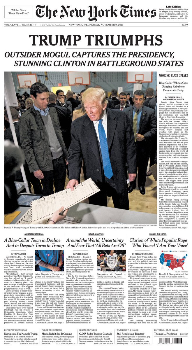
Related imageThe New York Times covered Trump's election with the heading "Trump Triumphs", this catchy alliteration contrasts with the negative outlook by The Daily Mirror, explained by the newspapers' opposite political views. The central image used by the newspaper is one of Trump handing his ballot, suggesting he's a good, responsible citizen. This positive persona created due to the newspaper's agenda, is also highlighted by the subtitle "outsider mogul captures the presidency, stunning Clinton in battleground states", which makes him seem God-like. 

Research and find out which organisation is responsible for the regulation of the content of British newspapers, and how you make a complaint about accuracy or offensive content in a newspaper.
Independent Press Standards Organisation (IPSO)
The organisation considers complaints from newspapers and magazines with IPSO membership. Plus they consider complaints made under the Editor's code. In order to make a complaint, you can either call or contact companies through their website.

martes, 13 de noviembre de 2018

Film Advertising & Marketing

Movie: Crazy Rich Asians

Poster
Image result for crazy rich asians posterThe poster for this comedy, suggests it's a romantic comedy, due to its use of visual codes. The background is colourful and deliberately laid out that way to highlight its light and comedic tone. It contains peacocks, red and blue fans, along with green leaves and vibrant clothing like scarves, glasses etc. This highlights a stylish lifestyle, and because it's placed behind the main image it implies they're related to it someway or another. The main image is the couple, indicating they're the protagonists in the movie, and given their positive facial expression and gesture (i.e. they're hugging) they're in a happy positive relationship. They're dressed formally, in a suit and a dress, indicating their costumes are proper for a party or another formal event. The font continues the lighthearted but sophisticated tone with the typography in the title "Crazy Rich Asians", a gold block capital font in which the "rich" stands out as the biggest. This typography suggests the main plot of the movie has to do with wealth.
Trailer
The trailer establishes the lighthearted romantic mood throughout the two and a half minutes. For example music is used to emphasise comedy parts such as when someone spills a drink in Nicholas' shirt and there's a silent pause which juxtaposes with the quiet background music in the rest of the trailer. Another example is when there's no music and only dialogue, once Rachel starts to question whether Nick's family is rich or not and he claims they're "comfortable" to what Rachel responds "that is exactly what a rich person would say".
It begins with an almost comic-like separation btween the initial scenes in the trailer, from the skyline, thus the establishing shots set the movie in a city. In this way, when Nicholas mentions his family, there's three lines to separate his mum, dad and sister. It sets up a quick pace so that the viewer gets a fast clear idea of the plot (Nicholas proposing to Rachel and taking her to meet her family in Singapore).
Typography is also used towards the end of the trailer, along with shifts of music volume to emphasise the audience's attention towards the words. The background is green, just like the poster, which makes it stand out along with the yellow words, contrasting in order to drive attention to the message.
At the end, the title for the movie is shown, with the last word changing from "food" to "parties", "family", "style", "mother" to "Asians". All those words tie in with the narrative, so anchorage has been used.
The audience will expect a lighthearted romantic comedy, as both the trailer and the poster highlight these through visual codes and the trailer with moving image and audio codes as well.

martes, 30 de octubre de 2018

Advertising and marketing

TV advert- Lancome La Vie Est Belle

"Lancome" is a French luxury perfumes and cosmetics company that distributes products internationally. Its headquarters are in Paris, France. This is part of their brand identity, as the name of the perfume being advertised is in French. This could be a problem as the language being used could not be known to potential costumers,  however given the nature of the company, producer of luxury perfumes, this only adds strength to their soft sell. In the advert, such stylish and elitist mood is represented through the narrative of the TV advert (a lavish party full of classy people) and the overall lightning and colour.  Dark tones of purple, black, pink as well as cool blues and whites embody the contrast between good and bad, given as Julia Roberts is wearing white and the rest of the party go-ers black, with her being the only one that "breaks free of the dictates and convections". 

This problem is presented in the narrative, with the intro saying "In a world full of dictates and convections, could there be another way?", the persuasive language of rhetorical questions heightens the audience's attention. The "dictates and connections" are depicted with shiny strings, that presumably control every action of the "rich- classy people" attending the party. Julia Roberts, the chosen brand ambassador, is perfect as she's a loved movie actress who has starred in classic movies like "Pretty Woman", "My Best Friend's Wedding" and "Runaway bride". In all of these movies, despite the predictable romantic comedy plot of guy-meets-girl, the characters she's personified are women who dictate their own life and don't wait for a 'prince charming' to save them. This lines up with the fact she's the one who breaks her own chains.
The advert's mode of address is positive, highlighted by Julia Robert's facial expression, with the smile in the end, displaying the name of the perfume in the end "La Vie Est Belle". The music ties in with this idea, with lyrics such as "it's a beautiful day", etc. This plays on the audiences' possible desire of being unique and to stand out, which this perfume implicitly states through the constant cuts between the party attendees and Julia. The editing further contributes to sell the product.

Print advert- Asics' "Sound Mind, Sound Body"
Image result for asics sound mind sound bodyThis advert is quite minimalistic due to the choice of basic colours like black grey and white, with the focus being the visual figure as it is large and placed on the left side. The tagline is right next to it, making the visual more effective as it is easy for the audience to follow. The brand is centred around sportswear Asics, which means they care about physical wellbeing, however with this advert they suggest they also care about emotional and mental wellbeing, improving their brand identity. Half the visual contains words like "insecurity", "rage", "sadness", etc, so the graphics display negative emotions which cover half of the woman, with the other half is the woman running through what seems to be a water wall, so the other side is clear from any negativity. The woman's facial expression seems to be positive as she's smiling, suggesting with Asics' sportswear you can face your struggles as well, in order to have a "sound mind [and] sound body".

The brand is aware of the current mental health awareness, with many people speaking out about these issues, unlike the past stigma directed towards such, therefore using audience's fears to gain money. With the tagline of "Sound mind. Sound body" the company looks to concentrate on the words "mind" and "body" as they're in bold. The font follows the minimalistic tone as it is simple, which evokes calmness. It is persuasive as all words used are single syllables, which makes the sentence catchy and easy to remember. In the bottom right, in a smaller font, the company seems to use a fact for their gain, as it says "running cleanses the mind and the body", with the company logo being strategically placed after, to advertise one last time their products.

miércoles, 10 de octubre de 2018

Artist's use of media

How Taylor Swift uses media to promote their star persona
At the beginning of her career, Taylor had the "cute girl next door image", partly due to her breakout hits: Love Story and You Belong With Me. This was definitely used when promoting her image:
2010 cover of a teen magazine

Even though she was 20 at the time the fact that she was still featured demonstrates the star persona she wanted to promote, a sweet and relatable girl, who has dealt with insecurities and sends quirky text messages with her friends. The font used for her name is a bright pink, a colour that is often associated with girls, which along with the cover lines "Move away from that boy!" and "Flirt with fashion" shows the superficial aspect of the magazine.
“When I need to vent or have a rant about something that’s bothering me, I’ll call my friends Emma (Stone) or Selena (Gomez), who can always cheer me up” she’s like a ray of sunshine! And Katy (Perry) always sends me the most hilarious text messages.”
On her fans: “They’re girls my age who I’d be hanging out with if I was at school right now. We have a close relationship. If they come to a few shows, I remember them. I’m not going to put up a weird barrier between me and my fans” I wouldn’t have any of this without them.”
Related imageThis contrasts with the type of magazine covers she does now, as she's 28 and she's gone through a change of image with the release of Reputation. The colours used are much more darker, and for example, the dark red and bright orange fonts simply show that.
An aspect that still hasn't changed is the use of media to reach her fans, perhaps with a developed commercial side, with the "72 pages containing handwritten lyrics by Taylor" and "personal photos" along with "poetry and paintings". This is an example of how artists release their own products to promote their music while making fans feel special by collecting special limited editions.
She starred in the 2010's film Valentine's Day, which featured several other famous stars such as Julia Roberts and Anne Hathaway. The genre of the film, a light-hearted romcom, fitted with the expectations of her as a person in her early days. This appearance was during her Fearless and Speak Now era, hence why it was furtherly contributing to the sweet innocent image of hers. She also did the voiceover of Audrey in the animation film of Lorax, which additionally adds to her initial innocent image.  
Her use of social media had stopped after her incident with Kanye West, making her comeback really hyped and anticipated. She took to Instagram to promote her first single of the new album after taking a long hiatus.
Given Reputation is her second world tour, she's constantly promoting her tour on Instagram, with pictures of every concert in different cities, used in order to make the audience feel considered and also to promote future tours.
Her use of Twitter is more promotion rather than building her star persona and sharing her life, which is displayed by how her last tweets were months ago about the new video for Delicate and her opening acts for the upcoming tour; her retweets usually revolve around her, like when she retweeted Variety and Rolling Stone's tweets about the start of her Reputation Tour, and quoted "Amazing!" on James Bay's cover of one of her songs on BBC Radio 1's Live Lounge.

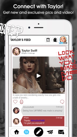
On late 2017 she released her first app, called "The Swift Life", which promises users they can interact with Taylor, "including exclusive pics, video, news and an experience you won't get anywhere else". This contributes to her brand and star persona which relies on her strong fan base and their wish to interact with her.
Lastly, recent news about her support for the democrats break her silence on politics of the past, showing a change of views, as she's now vocal about her opinions.
In the past I’ve been reluctant to publicly voice my political opinions, but due to several events in my life and in the world in the past two years, I feel very differently about that now.
 She goes on to argue against Marsha Blackburn, who hasn't supported equality for women and LGBTQ+, as she urges people to "please educate yourself on the candidates running in your state and vote based on who most closely represents your values." Some of her fan base are young adults, and this shows she's aware of it, because she's trying to encourage young people to vote. This contrasts with her silence on the last US presidential election, when unlike other artists she wasn't vocal about who she was voting for.

Taylor Swift's Star Persona

Star Persona Presentation

viernes, 28 de septiembre de 2018

Share a Coke Campaign

Share a Coke was a marketing campaign Coca-Cola launched in 2013 and 2014 after the company finally found a viral campaign that'd increase mass consumption. It consisted of replacing their iconic logo with either a common word or names.

Instead of appealing to the masses, they appealed to individuals. The message was simple, to share a coke with whomever's name was on the front. That, or either try and get your name.

I think it was quite successful, as proved by the statistics which show that more than 150 million personalised bottles were sold in 2014.  One of the reasons why the campaign was successful were the light-hearted TV advertisings for the summer which, along with the website where cans could be personalized, with now even more names were available, meant more people would be likely to want to find theirs or another's. The users could also share their images on social media with #Shareacoke in platforms like Twitter and Facebook, encouraging more people to do the same, in this way the platform also benefitted from the "global trend of self-expression and sharing" as marketing director Lucie Austin claims. 

jueves, 27 de septiembre de 2018

Cross Platform Advertising

Q. What is cross-platform advertising? Give a definition using detailed examples (300 words) 
Cross-platform advertising (also called cross-media) refers to advertising through different media platforms such as tv, mobile, etc. It increases the chances of reaching a costumer so that they buy a product. Throughout this essay, I will be exploring cross-platform advertising with the help of examples in order to demonstrate how it is used to target audiences effectively. Cross-media is often used by businesses with decent budges, as it's the smartest option in order to sell your product because of its efficacity.
One of the media forms that can be used is print e.g. in the bus, tube, etc. These are the printed adverts that one can see if they take public transport, which is most people's option. It's an optional choice, as several people have to move through such means, to get to work, school and other commitments, meaning they're really likely to come across the printed adverts throughout their journey.
Another media form is TV. The adverts play while there's a break or two in between programs, indicating viewers have to stick around, waiting for the program to resume, having to watch some or all of the commercials.
A type of media similar to TV is the radio. Here, the adverts play between music, and instead of visual they solely rely on sound. However, marketing consultant Mike Brassil claims "radio advertising is relatively cheap compared to print or television" which makes it an attractive choice to businesses that want to get their product out there.
Social media is one of the modern media platforms, which also contain ads. These run whilst you're watching a Snapchat or Instagram story, as well as whilst you're scrolling through your timeline. It effectively places itself in a platform that's widely used and can be used anywhere, unlike print, TV and radio. It stops the viewer and can draw them in if they're curious about the product that's being offered.
Oftentimes, advertising is suited to each demographic, as there are ads for every type of audience. This helps build the success of an advert campaign as it will reach people that are likely to buy the product. An interested audience will make cross-platform advertising more successful.
On the other hand, cross-platform advertising could also have the opposite effect, and because it is constantly advertised everywhere, the audience could be annoyed at the repetitive nature of it. It could also have a negative effect as adverts among media forms such as stories, or TV programs interrupt the viewer whilst they're doing something.
In conclusion, I think cross-platform advertising is effective as it is spread throughout various media platforms, meaning it will constantly chase the audience, and make the advert memorable. However, they could also have a negative effect and annoy the audience.

martes, 25 de septiembre de 2018

Music Video Analysis Key Terms

Purpose: Promotion of single/ album/ artist- to increase sales in an artist's music

Style:
Performance- the artist can be seen lip singing along with the music (e.g. Single Ladies)
Narrative- the music video tells a story (e.g. Norf Norf)
Thematic- theme of a song  is taken and something different is done with it (e.g. This Is America)
music videos can contain different types of styles, in fact they often do (e.g. California Girls)

Moving image codes:
Camera- shots (close up)- to give a first impression of the person in the shot e.g. Vince Staples at the beginning of Norf Norf expresses confidence
            - angles (high/low)- often to express dominance or roles between people e.g. in the end of Norf Norf there's a slightly high angle which makes him seem smaller in the frame and could've been used to express how the viewer sees him differently now he's in prison
            - movement (pan/tilt/zoom)- focus on a specific area
Editing- cut e.g. upbeat songs can use lots of cuts
            -fade e.g. ballads would use the fade effect instead of cuts
            -pale
            -cut to beat

Visual codes:
Expression and gesture- e.g. facial expressions and body language can present a person in a music video as likeable or unlikable
Costume and props- e.g. clothes from older centuries (colonial and 20th century America)  are used in Beyonce's Formation video to contribute to the message she wants to send
Iconography- e.g. police car
Lightning and colour- e.g. the black and white palette used in Beyonce's Single Ladies video showcases classiness and glamour
Graphics- explicit messages which can briefly explain the meaning of a music video e.g. Beyonce's formation video contains the phrase 'Stop shooting us' written on a wall to express her opinion on police brutality against African-Americans

Key terms:
Genre
Star persona- how the artist presents himself to be like e.g. Bob Dylan's Subterranean Homesick Blues contributes to the songwriter aspect of his star persona as he used to be praised for his lyrics which is what the video consists of.
Motif- anything used repeatedly by an artist e.g. Beyonce's costumes and dance
Anchorage- the union of the visual element of a video and the lyrics of a song
Binary deposites- two opposite aspects expressed in a music video e.g. independence vs relationships in Meghan Trainor's Dear Future Husband
Intertextuality- media form referring to another media form (more often in films)

miércoles, 19 de septiembre de 2018

Representation of gender in the media

Task: Explore how gender is represented in at least two examples from the media (TV, magazines, music videos, games, film, TV advertising, etc)

Click here to view essay

lunes, 17 de septiembre de 2018